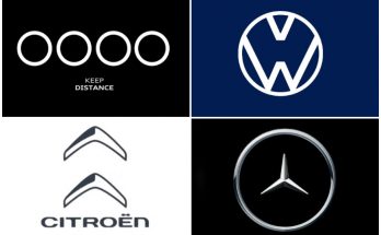
Car logos or an emblem tell a lot about the reputation of a particular car brand. A logo is a loaded design which is usually iconic, synonymous with a company’s brand, and inspires trust in a product, while also communicating power, reliability and prestige.
A lot of old car companies heavily relied on their emblems. They work hard to make that emblem have a life of its own; thus their customers can take pride by having that logo on their cars.
In most cases there is a story behind these car logos. Have you ever wondered what they actually stand for? We have compiled a brief story about the humble beginnings of these companies (with presence in our market) and what led them to design their logos in the way it is being shown now.
VW
Founded in 1937 and headquartered in Wolfsburg, Germany, Volkswagen is one of the global leaders in automotive industry and the largest European car manufacturer.
The word Volkswagen means “people’s car” in German. Volkswagen logo is widely credited as one of the most memorable and popular logos in history. The Volkswagen logo comprises of the company’s initials – a “V” placed over a “W” – and both these letters interact superbly with each other.
The blue color in the Volkswagen logo symbolizes excellence, reliability and class – whereas the white color depicts nobility, purity and charm. “Das Auto” was the official VW slogan. However in 2016 after it was defined by a massive emissions-cheating scandal, the company decided to shelve its tagline “Das Auto” which simply means “The Car”.
BMW
BMW (Bavarian Motor Works) is a German automobile company founded in 1916, it also owns and produces Mini cars and Rolls-Royce branded cars. BMW is one of three best-selling luxury automakers in the world, along with Audi and Mercedes-Benz.
The BMW logo contains a think black circle which is bordered by a smooth silver outline holding company’s name in a prominent position. The core of the circle is broke up into four quadrants with national colors of Bavaria – blue and white.
The BMW logo is widely regarded as one of the finest car logos in the history of graphic design. The logo comprises of three colors where the black stands for the elegance and excellence of the company, white represents purity and charm. The blue color signifies the strength and reliability of its products. The worldwide BMW slogan is “Sheer Driving Pleasure”.
Mercedes-Benz
Although the evolution of the logo comprises more than 120 years, most of its life it has been represented by today’s badge — the triangle star, one of most well-known logotypes in the car industry.
First introduced in 1909, the logo comprises of an illustration of a three-pointed star that symbolizes the company’s “domination of the land, the sea, and the air”.
In 1926, after the merger of Benz and Daimler, which resulted in the inception of a new German automobile brand – Mercedes-Benz, the actual trademark was finally developed. It is a star of three pikes embosomed with a bordering with laureate wreath and the brand name on it, which still designates Mercedes cars. Since then the logo has experienced insignificant amendments, the bordering of laurel wreath morphed into an unpretentious circle.
The Mercedes logo is an extremely effective corporate logo and due its striking simplicity, clarity and consistency, it is very easy to remember and recognize. The most frequent colors that you will see in the Mercedes logo are black and silver. The silver color depicts sophistication, creativity and perfection, whereas the black color stands for elegance, integrity and purity. It has now become one of the world’s most popular, adored and instantly recognizable logos. The slogan of the company is “The Best or Nothing”.
Audi
Audi is among the best-selling luxury automobiles in the world. The company name is based on the surname of the founder, August Horch. “Horch”, meaning “listen” in German, becomes “Audi” when translated into Latin.
The Audi symbol is four ceiling rings that reflect the four manufacturers of Auto Union. This Audi emblem signs the association of the brand Audi with others: Horch, DKW, Wanderer: the initial ring from at the left side represents Audi, the next represents DKW, the third is Horch, then the fourth ring is Wanderer.
The logo was lately changed in 2009, to celebrate Audi’s 100th birthday. The chrome color of the Audi logo is bright and slick, which lends it a very modern and sophisticated touch. Audi’s slogan is Vorsprung durch Technik, meaning “Advancement through Technology”.
Porsche
Porsche was founded in 1931 by Ferdinand Porsche of Stuttgart, Germany. The central part of the Porsche logo depicts a black horse headlong, an expression of forward putting power and an origin of the city note.
Black and red stripes and antlers are symbols of the German region of Baden-Württemberg, the inscription «Porsche» and prancing stallion on the logo reminded that native Stuttgart brand was created as a horse farm in 950. The author was Franz Xaver Raymshpiss.
The Porsche logo is widely regarded as one of the most memorable, enduring and widely recognized logos in the automobile industry. The logo was adopted in 1952, when the brand came to the US market, for better recognition. Previously just the inscription «Porsche» was on the hoods of the cars.
Toyota
Toyota Motor Corporation is a Japanese automotive manufacturer headquartered in Toyota, Aichi, Japan. The company was founded by Kiichiro Toyoda in 1937, as a spinoff from his father’s company Toyota Industries to create automobiles.
The Toyota logo has evolved over the period of time. The current version of the Toyota logo was introduced in 1989. It comprises of three ellipses that symbolize wheels, motion, speed and unity. Taking a closer and more careful look, one can easily notice that the two intersecting ellipses in the middle, combine to form the letter “T”, are surrounded by the third. These intersecting ellipses are meant to represent customer and the product, while the outer ring typifies the world and the global nature of the company. Toyota’s slogan is “Let’s Go Places”.
Honda
Honda is a Japanese multinational conglomerate corporation primarily known as a manufacturer of automobiles, aircraft, motorcycles, and power equipment.
Honda operates different manufacturing units which have unique logos. While the Honda motorcycles is represented by the Honda “Wings” logo, the Acura brand features the Honda ‘A’ logo. Moreover, Honda racing cars uses the Honda racing logo, Honda automobiles are adorned with the Honda ‘H’ logo, and the Shipping department bears the Honda “Marine” logo.
Honda cars are represented by an ‘H’ symbol, which is one of the most recognizable and eminent badges in automotive market. It represents magnificence, durability and confidence of every vehicle produced under company’s name. Honda’s slogan is ‘The Power of Dreams.’
Nissan
Nissan is the major brand of Nissan Motor Corporation, along with Infiniti, Datsun and NISMO. The Nissan logo is among the most popular and instantly recognizable car logos in the world, however it has undergone slight revisions over the period of time.
The current version of Nissan logo was unveiled in 2013. The chrome-colored theme in the Nissan logo represents sophistication, modernism, creativity and perfection of the company’s products. Nissan’s slogan is “Innovation that excites”.
Mitsubishi
Mitsubishi Motors Corporation is a multinational automotive manufacturer headquartered in Minato, Tokyo, Japan. In 2011, Mitsubishi Motors was the sixth biggest Japanese automaker and the sixteenth biggest worldwide by production. In June 2016, Mitsubishi was acquired by Nissan, thus becoming a part of the Renault-Nissan Alliance.
The company’s name originates from two Japanese words; “mitsu” meaning “three” and “hishi” meaning a rhombus or a diamond. The word ‘hishi’ becomes ‘bishi’ in Rendaku, which is a phenomenon in Japanese morphophonology that governs the voicing of the initial consonant of the non-initial portion of a compound or prefixed word.
The three rhombuses unite to form the Mitsubishi logo, which is sometimes known as the “three diamonds” emblem. The Mitsubishi logo exemplifies unity, technological precision and orientation towards the future. It is widely regarded as one of the most popular and instantly recognizable car logos in the world. Mitsubishi’s current slogan is Drive@earth.
Suzuki
Suzuki was founded in 1909 by Michio Suzuki. Headquartered in Minami-ku, Hamamatsu, Japan, Suzuki is considered to be the ninth biggest automaker by production worldwide.
The Suzuki logo comprises of a stylized “S”, the company’s initial, and the full name “Suzuki” next to it. First introduced in 1954, it has successfully stood the test of time for almost six decades now. The logo is an ideal example of a simple, clean and consistent, yet visually appealing and authoritative insignia. It is often considered as one of the most memorably and easily recognizable logos in the automotive industry.
Though the earliest Suzuki logo was designed in black and white palette, the emblem seen of the company’s vehicles today is all silver.
Mazda
The name Mazda is derived from Ahura Mazda, with Mazda meaning wisdom. Ahura Mazda the god of light, intelligence, and wisdom from the first civilization in West Asia, is also the name of God to Zoroastrians. The company website also notes that the name also derives from the name of the company’s founder, Jujiro Matsuda.
Mazda was founded in 1920 and is currently headquartered in Fuchū, Aki, Hiroshima, Japan. As of 2011, Mazda was the 15th biggest automaker by production worldwide.
The Mazda logo has undergone five major overhauls in its iconic history. The current Mazda logo has been in service since 1997. It features the company’s name underneath a stylized representation of the letter “M”. The distinctive and gently curved “M” is strikingly clever and elegant, developing into the shape of stretched wings. This gives the overall design an “owl-like” attribute, according to some branding experts. The wings are known to exemplify the fact that the company is futuristic, goal-oriented and innovative. Mazda’s slogan is Zoom-Zoom.
Hyundai
The Hyundai Motor Company is a South Korean multinational automotive manufacturer headquartered in Seoul, South Korea. The company was founded in 1967 and, along with its 32.8% owned subsidiary, Kia Motors, and its 100% owned luxury subsidiary Genesis Motors, which together comprise the Hyundai Motor Group. It is the third largest vehicle manufacturer in the world.
The logo is basically a tilted H letter, embedded into an oval shape thus representing two human figures, one of the customer and the other one of the company, united in a handshake. That was meant to symbolize mutual trust and respect. Overall, the Hyundai logo creates an image that has already become well recognizable all over the world. Hyundai’s slogan is “New Thinking, New Possibilities”.
KIA
Headquartered in Seoul, KIA is South Korea’s second-largest automobile manufacturer, following the Hyundai Motor Company, with sales of over 3.3 million vehicles in 2015.
The current emblem of Kia is very simplistic, featuring the company’s name placed on red background, embedded into the silver oval. However, the KIA logo has a specific feature that makes it particularly recognizable: the A letter misses the horizontal bar. The color of the font and background may vary between silver, red, white and black depending on the application.
According to Kia Motors, the name “Kia” derives from the Sino-Korean characters Ki (“to come out”) and A for (East) Asia, it is roughly translated as “arise or come up out of (East) Asia”. KIA’s slogan is “The Power to Surprise.”
Chevrolet
Headquartered in Detroit, Michigan United State, Chevrolet was founded in 1911 by Louis Chevrolet and William C. Durant. It is currently owned by GM (General Motors).
Chevrolet has one of the most recognizable logos in the world and it has changed little through the history. It is often described as a cross and is known in North America as a bowtie. However, despite featuring two intersecting patterns, the logo has little to do with both cross and bowtie. The horizontal parallelepiped is overlapped by the square to form a cross-like figure. It is painted yellow and gold and is easily associated with one of the biggest car brands. Chevrolet’s slogan is “Find New Roads”.
FAW
Founded in 1953, FAW (First Automobile Works) is a Chinese state-owned automotive manufacturing company headquartered in Changchun, Jilin, China. FAW is one of the “Big Four” Chinese automakers alongside Changan Motors, Dongfeng Motor, and SAIC Motors. In 2014, the company ranked third in terms of output making 2.7 million vehicles.
The FAW “winged 1” badge is derived from the Chinese lettering means “one” (first) “automotive”. The words constitute the wings of the eagle shaped, a blue sky eagle in a visual scene, meaning China FAW fly. The logo was introduced back in 1964.
Zotye
Zotye Automobiles is a privately owned Chinese automobile manufacturer founded in 2003 by Ying Jianren and is headquartered in Yongkang, Zhejiang, China. Its logo is a simple chrome-finished letter “Z” in chrome finish accompanied by words “Zotye Auto” in Chinese & English.
Proton
Proton was founded in 1983 by Mahatir Mohammed, headquartered in Shah Alam, Selangor, Malaysia. It is jointly owned by DRB-HICOM (50.1%) and China’s Geely Automobiles (49.9%).
Proton logo has evolved significantly over the period of time. From year 2000, it featured a stylized yellow tiger head on a green roundel embossed upon a dark blue shield, with the Proton name in yellow capital letters. The standard text representation of the Proton name was also changed from the lowercase italic text “proton” to the uppercase “PROTON”.
All Proton cars manufactured after 2000 carried the new badge, both in the domestic and export markets. Since 2008 with the badge became two-toned, silver and black design instead of the previously colored form. Proton uses the slogan “It’s in the Drive!”
Daihatsu
The name “Daihatsu” is a combination of the first kanji for Ōsaka and the first of the word “engine manufacture”. In the new combination the first reading is changed from “ō” to “Dai”, giving “Dai hatsu”. Formed in 1951 and headquartered in Ikeda, Osaka Prefecture, Daihatsu is a wholly owned subsidiary of the Toyota Motor Corporation since August 2016.
Daihatsu logo was one of the simplest car logos that were known to the public. It is represented by a capital letter D. As simple as it was, Daihatsu logo still managed to gain appeal to be public. It was also widely known especially to Japanese people. Among several car logos, Daihatsu logo was known for its unique but simple company representation. Daihatsu uses the slogan “We Do Compact.”

A computer animation professional with over 23 years of industry experience having served in leading organizations, TV channels & production facilities in Pakistan. An avid car enthusiast and petrolhead with an affection to deliver quality content to help shape opinions. Formerly written for PakWheels as well as major publications including Dawn. Founder of CarSpiritPK.com

